
NOTEBOOK
LOGO INSPIRATION
CLASSIC.RETRO.MODERN.
Here's a lesson in leaving something alone when it doesn't require your intervention, without leaving yourself out of the picture entirely. In early 2021, the editorial team behind Classic.Retro.Modern. came to me and asked if I would design a logo for their new magazine. They had a working title of 'Classic Retro Modern' but there were a few other names on the table.
Now, I'm a colossal car nerd and this sounded like the perfect job for me so I jumped at the chance and asked them to send me everything they'd been working on so I could get inside their heads a little bit before making a start. One of the things they sent was a mock-up image of a magazine with the name Classic Retro Modern, in black Helvetica, stacked over three lines in the top corner.
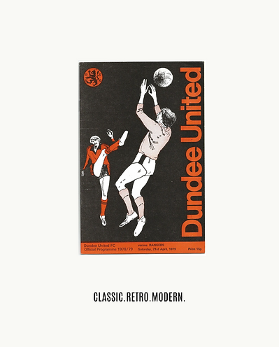
They'd nailed it. I couldn't improve on this. It was everything I would have done but probably better because it didn't look like someone had agonised over it, trying to include clever references and design flourishes. I told them I thought they'd got it right first time and I would put together a couple of graphics to show how it could work as a masthead and logo. This is where I felt I could add some value. I drew on my love for 1970s colour palettes, swiss typography, vintage magazine design, modernist municipial branding, and my favourite shade of orange (it's somewhere between Dundee United's 78-79 kit and British Leyland's Vermilion) to give them a full brand identity to go with their simple three-line logo. I then extended this branding exercise to include a range of mock-up magazine covers featuring several of the cars I would have loved to see featured in the magazine. I wanted to show them that I understood what made them tick and I was up for a much deeper collaboration than just a single logo design job.
Thirty-one issues later, I'm still here, art directing every single page and helping to set the overall tone of the magazine. I honestly think it's because I understood when to leave something alone, I risked admitting that the client had got it right without me, and I looked for somewhere else I could add real value, enthusiasm and commitment to the project.


